In Counter-Strike, a logo isn’t just design — it’s emotion, identity, and history. From 1.6 to CS2, these emblems carried the weight of eras: some drawn in Photoshop on old CRT monitors, others crafted by full design studios.
What changed over time is the language of style. Early esports logos were loud, colorful, oversized — screaming for attention. Today’s versions are the opposite: minimal, clean, and global. That evolution mirrors Counter-Strike itself — from local tournaments to a worldwide stage of professionalism.
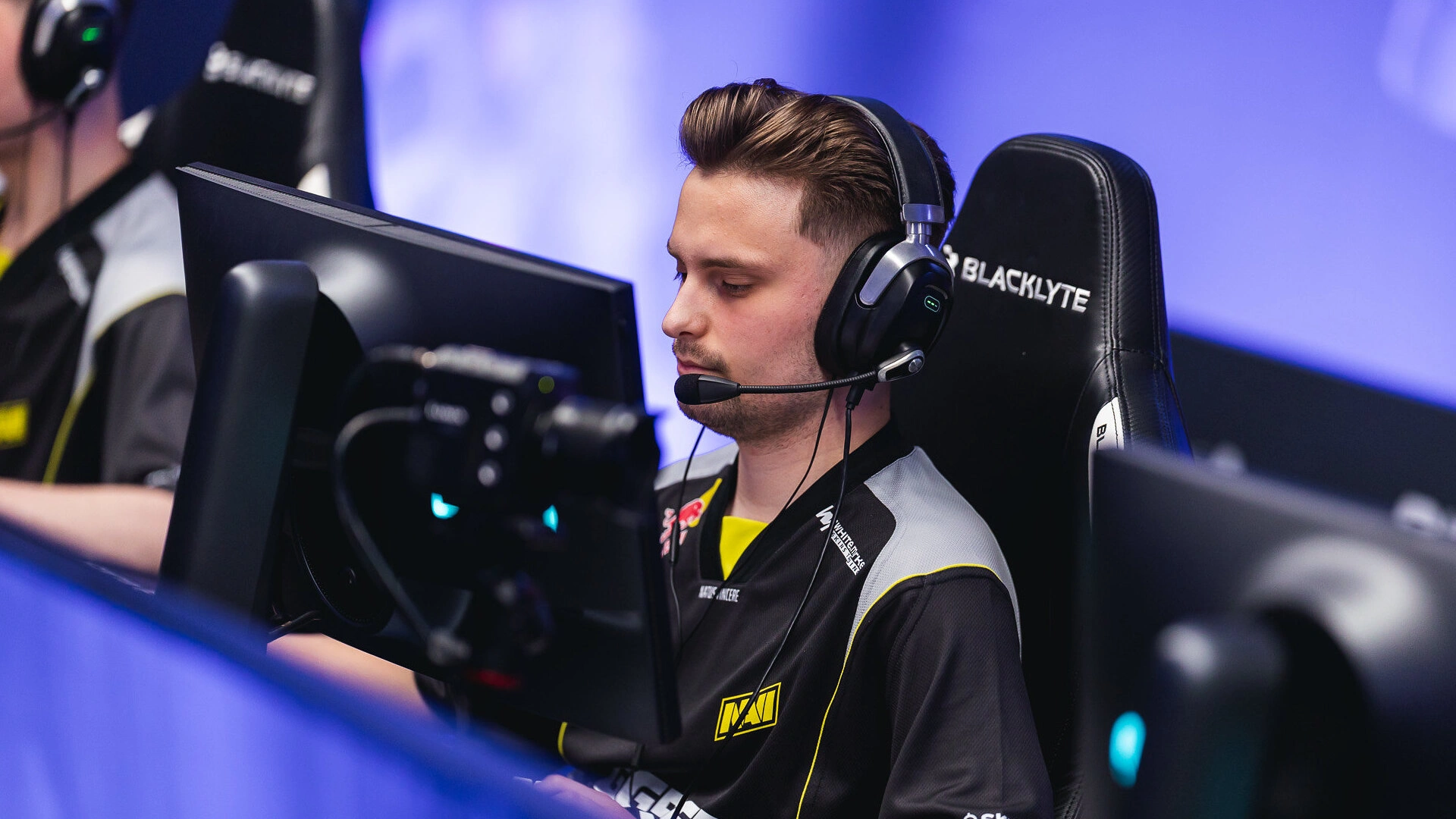
Natus Vincere
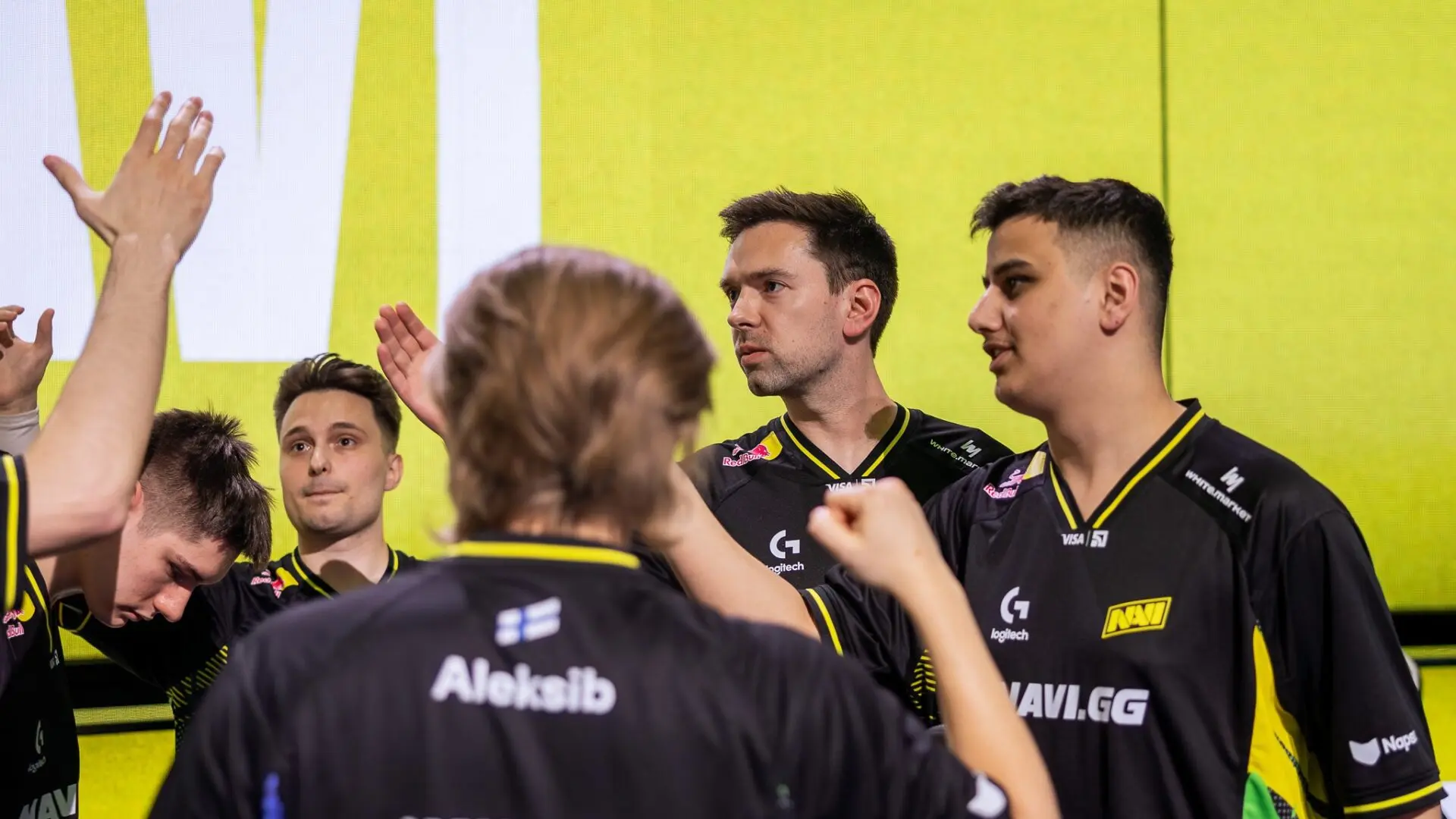
Founded in 2010, NAVI defined the CIS scene’s rise. The Zeus–Edward–markeloff trio built one of the first dominant international rosters, and a decade later, the s1mple–electronic–B1t era conquered it all with a Major and the Intel Grand Slam. NAVI became the model of structured success and homegrown dominance.
The old yellow “Na`Vi” rectangle was aggressive and raw — perfect for its time. The 2020 redesign turned it global: balanced typography, softer edges, and a refined tone of yellow. What was once regional now looks world-class.
read more
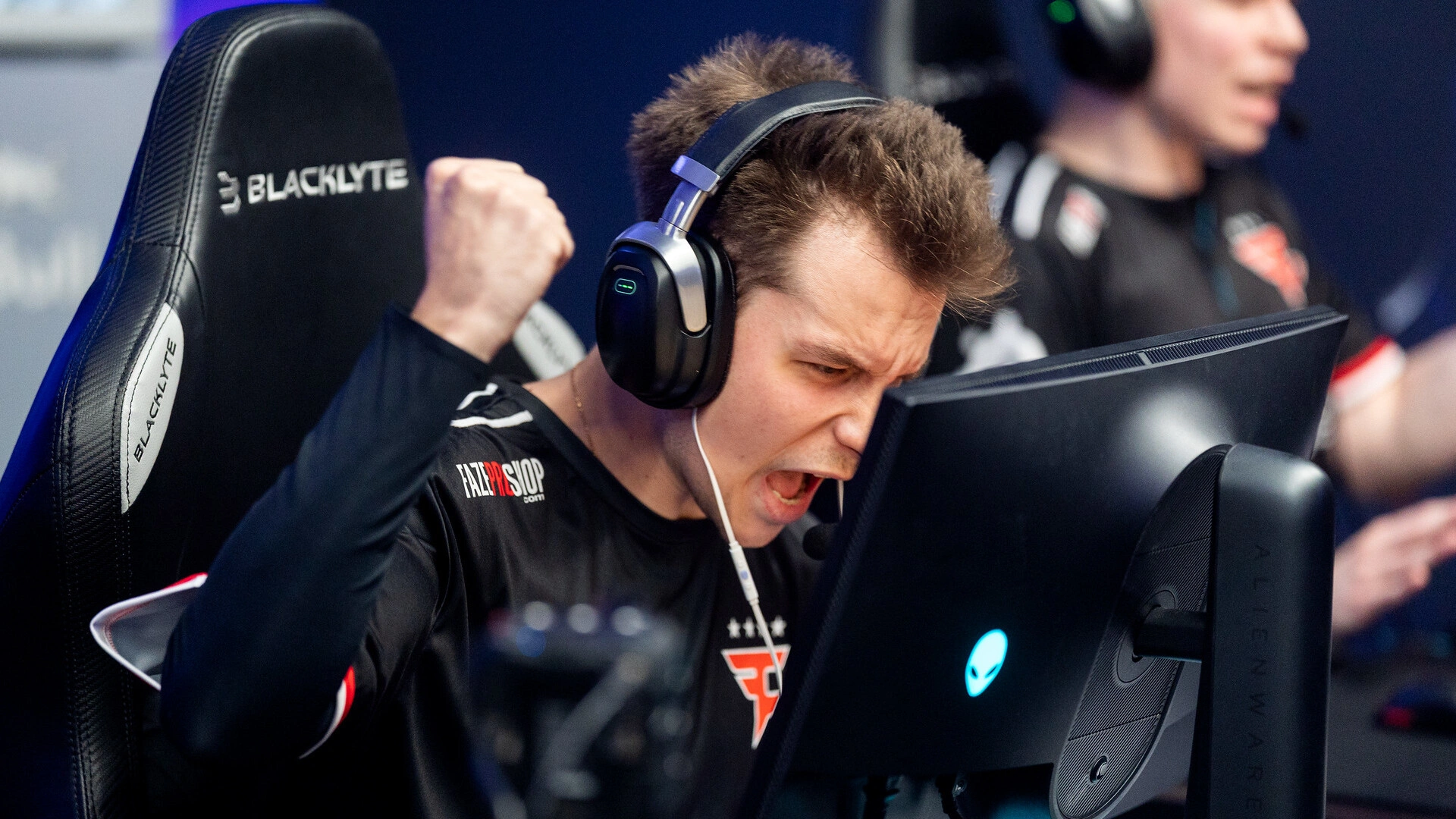
FaZe Clan
FaZe entered Counter-Strike in 2016 and changed what a roster could look like — international, high-skill, high-brand. From NiKo and rain to ropz and broky, they built one of the most feared lineups. Their 2022 run — Katowice, Cologne, EPL, and the Antwerp Major — was pure domination.
Born from Call of Duty montages, their red-blue “FZ” design was chaotic and flashy. Today it’s sleek, geometric, confident — reflecting a matured identity that matches their global reach.
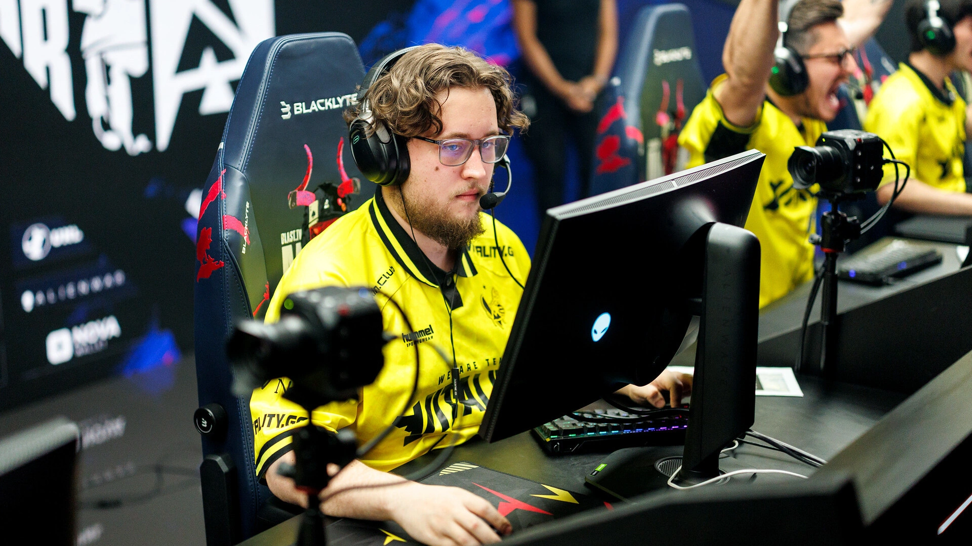
Team Vitality
The French powerhouse rose around ZywOo — a generational talent. With apEX, spinx, and dupreeh, they built a team of balance and precision. Their crowning moment came at BLAST Paris Major 2023, a storybook win on home soil.
The cartoon-style bee evolved into a futuristic metallic symbol, with sharper lines and hexagonal logic. Vitality’s logo grew from local esports charm to European design elegance.
G2 Esports
G2 mixed chaos and charisma better than anyone. From the shox–ScreaM duo to today’s NiKo–huNter–m0NESY core, they became a team defined by creativity and firepower. Their 2023 titles in Katowice and Cologne confirmed their rebirth as modern CS kings.
The samurai face, once playful, is now minimalist and iconic. Fewer lines, stronger shape — reflecting G2’s shift from entertainment to execution.
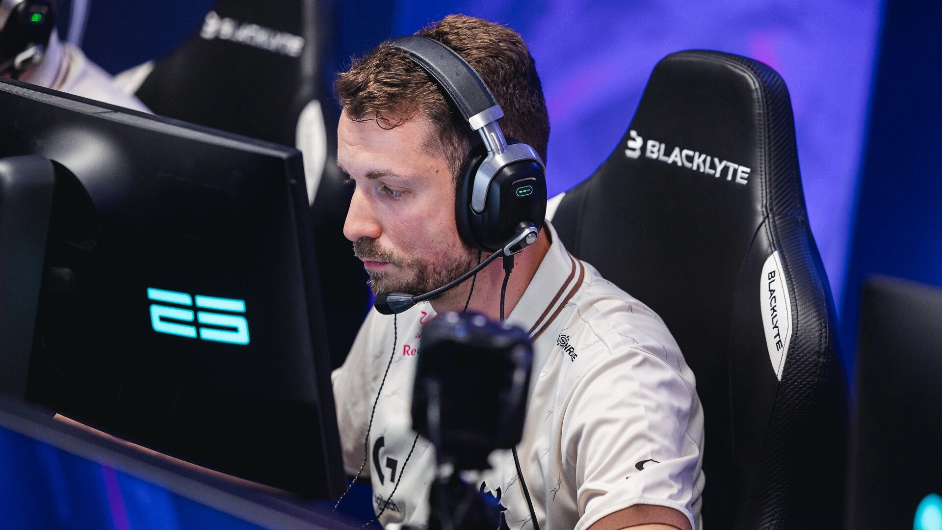
MOUZ
One of the oldest European clubs, MOUZ has been producing stars since the 2000s — from ropz and chrisJ to frozen and siuhy. Their focus on academy growth made them a symbol of sustainable success.
read more
Their original 2002 red mouse was big, round, and friendly — a LAN-era logo. The current design is minimalist, abstract, and professional — perfectly matching the clean visual era of CS2.
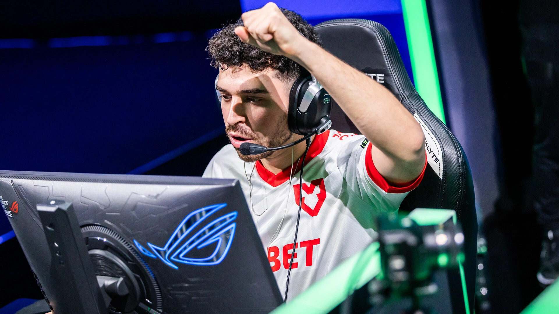
Ninjas in Pyjamas
The Swedish legends defined the start of CS:GO, going 87–0 on LAN and shaping what dominance looked like. f0rest, GeT_RiGhT, and Xizt were the faces of discipline and control. Today NIP continues the legacy with international firepower.
The shuriken, once golden and complex, is now sleek and geometric. It still whispers “discipline” — but now in the minimalist language of modern design.
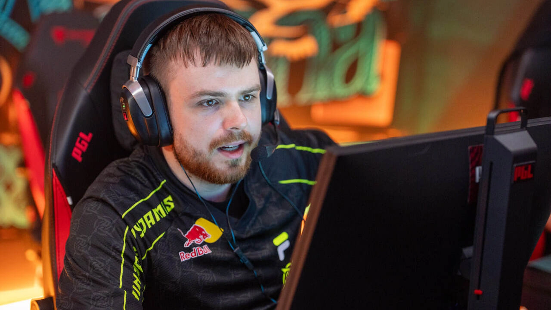
The MongolZ
Once outsiders, The MongolZ became Asia’s front-runners in CS2. Their fearless, aim-heavy playstyle made headlines in 2024–2025, putting Mongolian Counter-Strike on the map.
The old logo showed a fierce warrior — detailed, wild, raw. The new version is simple yet powerful, built for a modern audience. A perfect match for a team turning from underdogs to world contenders.
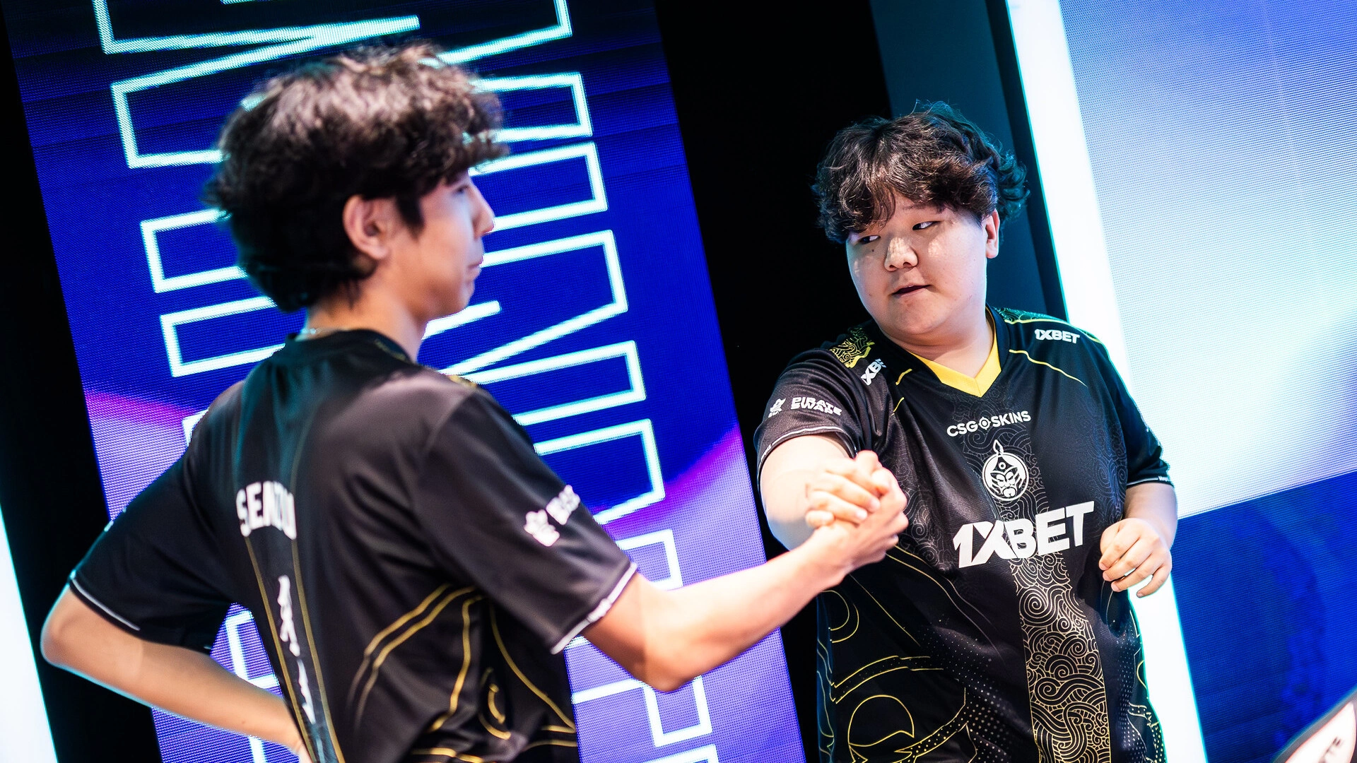
Fnatic
One of CS’s oldest dynasties. From f0rest and dsn in 1.6 to flusha, JW, and KRIMZ in CS:GO, Fnatic have held every major trophy at some point. Their black-and-orange brand became synonymous with creativity and resilience.
The once-heavy, stylized “stickman” shape got rebalanced into a bold, simple form. Modern Fnatic design blends heritage with clarity — less detail, more identity.
Team Liquid
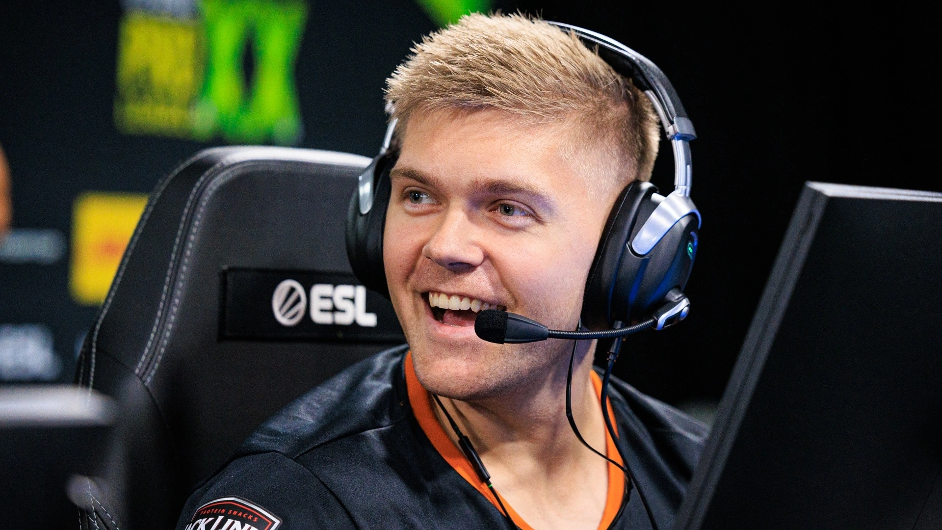
North America’s crown jewel. Liquid climbed from underdogs to world-class, powered by legends like nitr0, EliGE, NAF, and Twistzz. Their 2019 season — IEM, EPL, Cologne, and the Intel Grand Slam — remains one of the best ever.
The galloping blue horse turned from glossy and detailed to flat and modern. Still proud, still fast — but now fitting for the clean lines of the CS2 era.
Cloud9
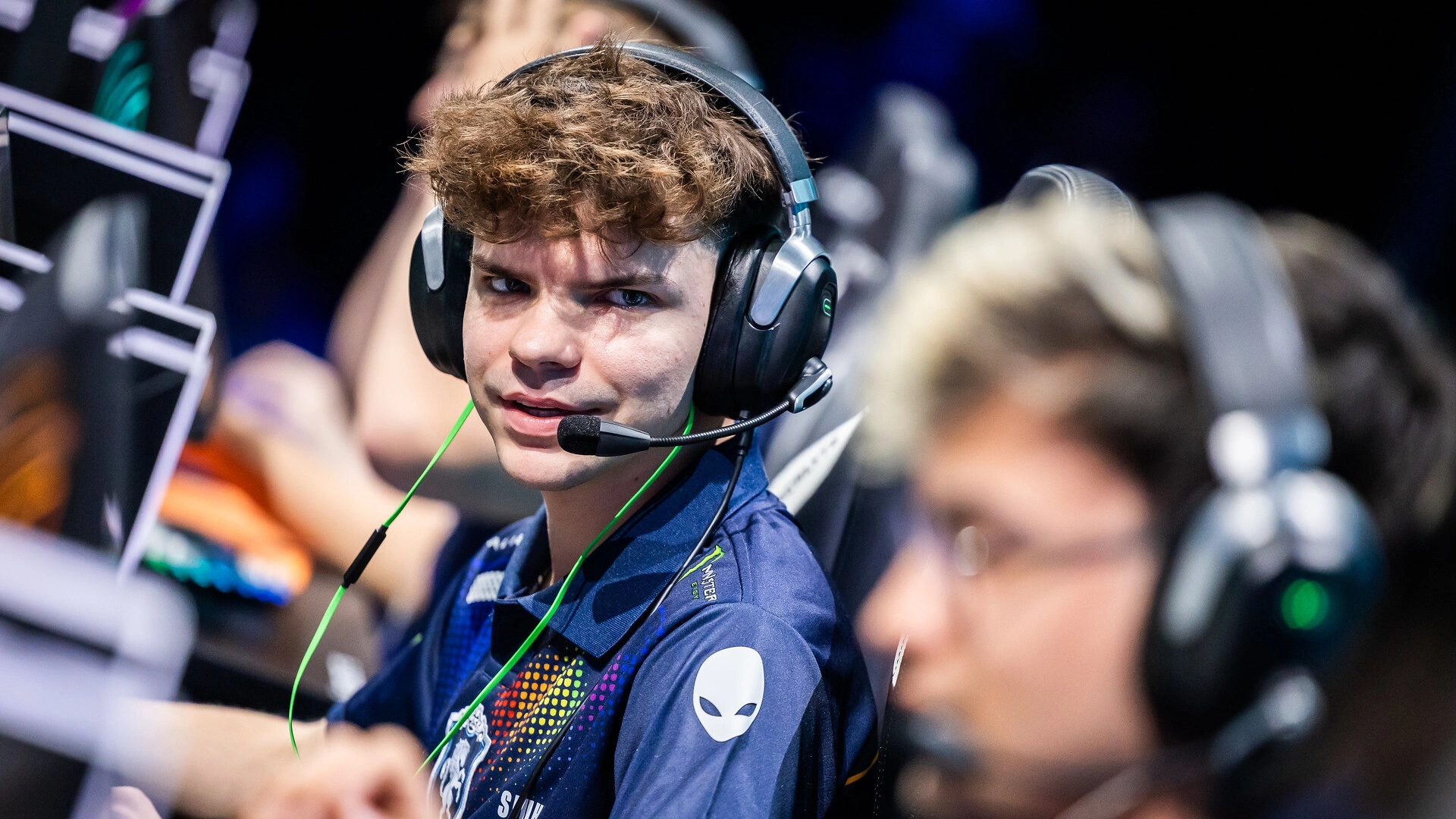
The miracle team of 2018 — the first North American Major champions. Skadoodle, tarik, autimatic, Stewie2K, and RUSH became instant icons. In CS2, Cloud9 continues the story with international talent and the same blue spirit.
Their triple-cloud swirl barely changed — only refined. It’s one of the rare logos that stood the test of time by staying simple from day one.
From Noise to Clarity
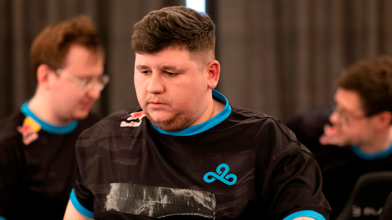
If old logos shouted, modern ones speak confidently. Minimalism in CS2 design isn’t about losing character — it’s about sharpening it. The same way the game evolved — fewer pixels, more precision — teams learned that simplicity can carry the most power.


