A symbol recognizable at first glance. Ninjas in Pyjamas have updated their brand, bringing back the emblem that marked the beginning of their story in the Counter-Strike world. However, this time it’s not only about nostalgia — it’s also about rethinking their legacy.
A symbol that survived eras
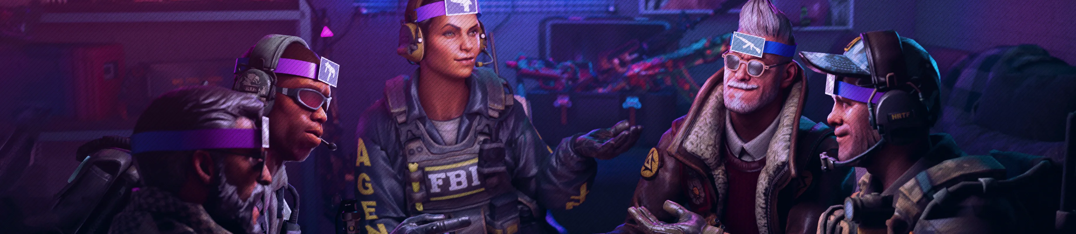
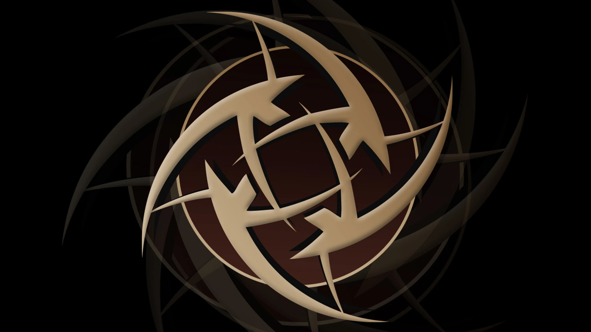
The new NIP logo is a modern interpretation of the old “shuriken,” which first appeared back in 2012. According to the organization’s statement, the updated version is “a symbolic form that connects the past with the present.” Every element of the design carries its own philosophy: Iconic, Geometric, Serif, Bevel — four stylistic principles that represent the brand’s strength, history, and uniqueness.
A mark that shaped a legacy.
Our iconic logo represents countless memories, victories and moments that built who we are today. pic.twitter.com/Vkb78h6Iu2
— NIP CS (@NIPCS) October 21, 2025
Return to the roots
Ninjas in Pyjamas is one of the oldest and most recognizable organizations in the Counter-Strike world. Under the old logo, the team won ESL One Cologne 2014 and reached Major finals, laying the foundation for future generations of players.
After several rebranding attempts since 2017 (including the minimalist golden version in 2021), fans repeatedly called for the return of the “real shuriken.” Now it has happened — but with a modern touch, where the traditional emblem is combined with 3D design details, serif fonts, and geometric contours.
The team today: a new generation of ninjas
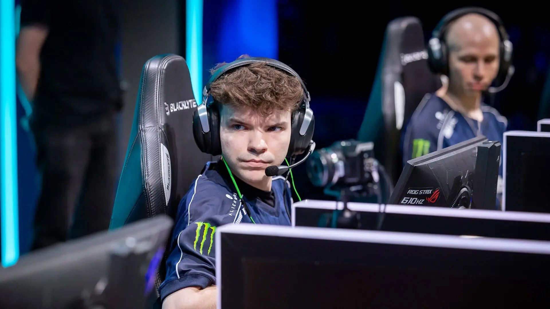
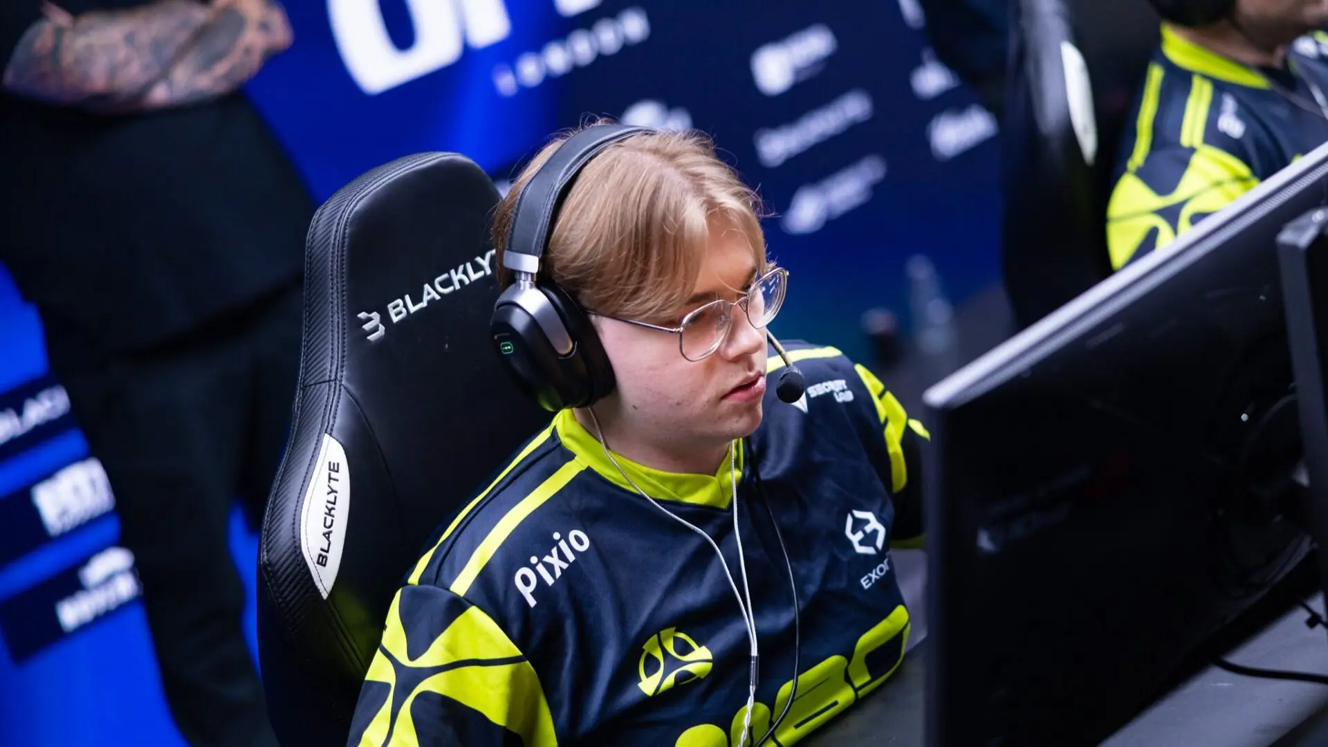
The return of the historical symbol coincides with the gradual recovery of NIP’s competitive form. The team currently ranks 24th in the world and 25th in the Valve Ranking. Under the leadership of Richard “Xizt” Landström, the roster has shown stability — a 45% win rate over the past three months and noticeable progress following the summer lineup updates.
Ukrainian sniper r1nkle, who joined over a year ago, has become one of the team’s leaders with a 1.09 rating, alongside ewjerkz and xKapersky. Despite this, NIP are still seeking consistency at major tournaments — their most recent final was StarLadder StarSeries Fall 2025, where they lost to NaVi.
Redesign as a revival strategy
The return of the iconic logo is not just a gesture for fans — it’s part of a larger marketing strategy. According to NIP representatives, the brand aims to “restore its own DNA,” emphasizing continuity and uniqueness. In the esports scene, where teams often change their identities to appear more “modern,” Ninjas in Pyjamas are betting on tradition.
Analysts note that this move could strengthen brand recognition and renew interest in the team among older fans who associate NIP with the era of GeT_RiGhT, f0rest, and the first Major victories.
What’s next for NIP
The visual update coincides with preparations for PGL Masters Bucharest 2025, where NIP will face Heroic. This will be the first major tournament where the team performs under the new identity — a symbolic start to a new chapter for the legendary club.
Regardless of the results in Bucharest, the return of the “shuriken” has already worked — Ninjas in Pyjamas have once again become the number one topic in the CS2 community.